Delta Airlines

Context
Delta Airlines’ current search results and flight detail pages are heavily focused on luxury features, often including repetitive buttons and excessive graphics. This can make navigation clumsy and overwhelm users trying to find the most relevant flight information. The redesign aims to simplify the experience while keeping essential details easily accessible.
Design Challenge
  • Reduce clutter and repetitive elements on search results pages.
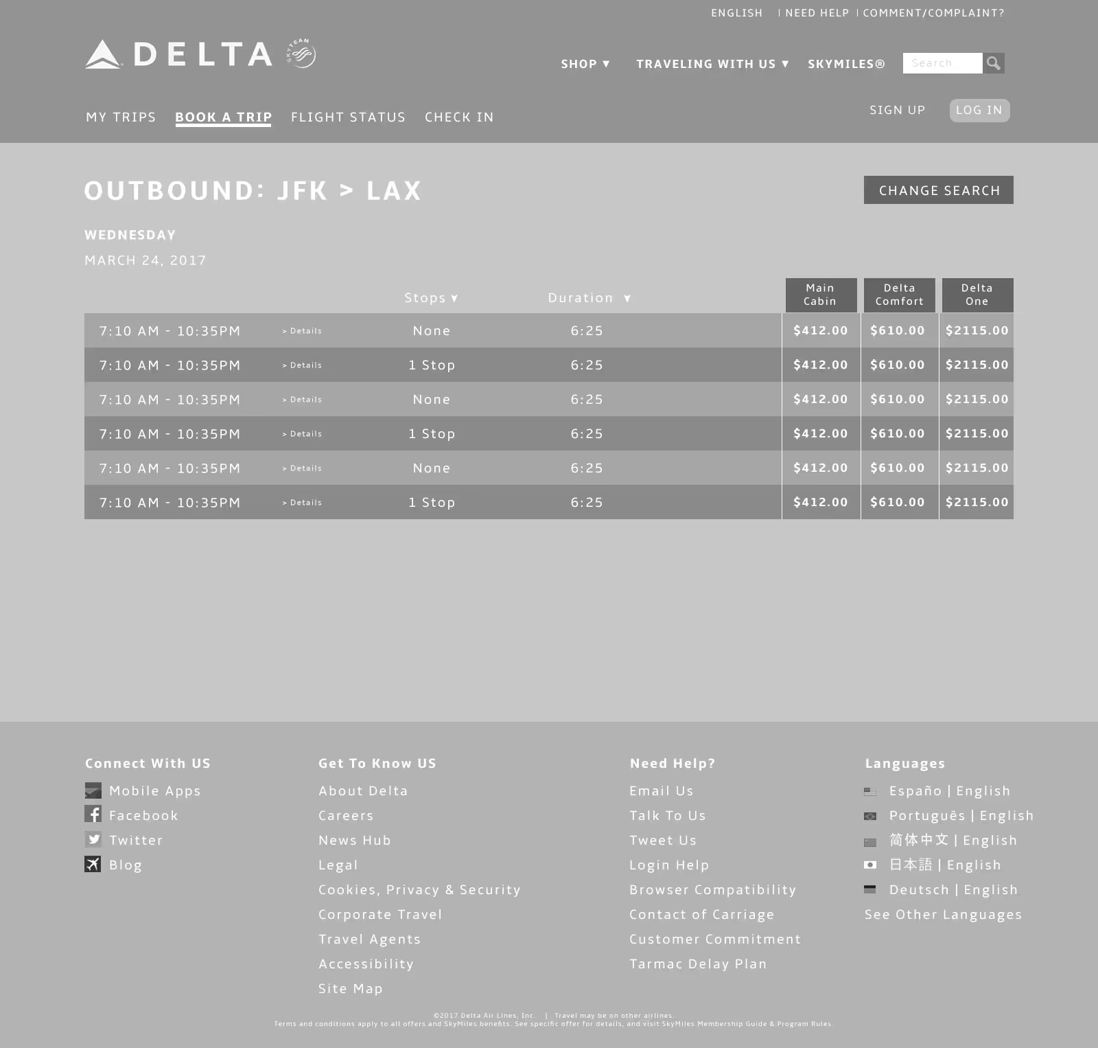
  • Prioritize essential flight information such as departure times, prices, and class options.
  • Make flight details expandable without overwhelming the user.
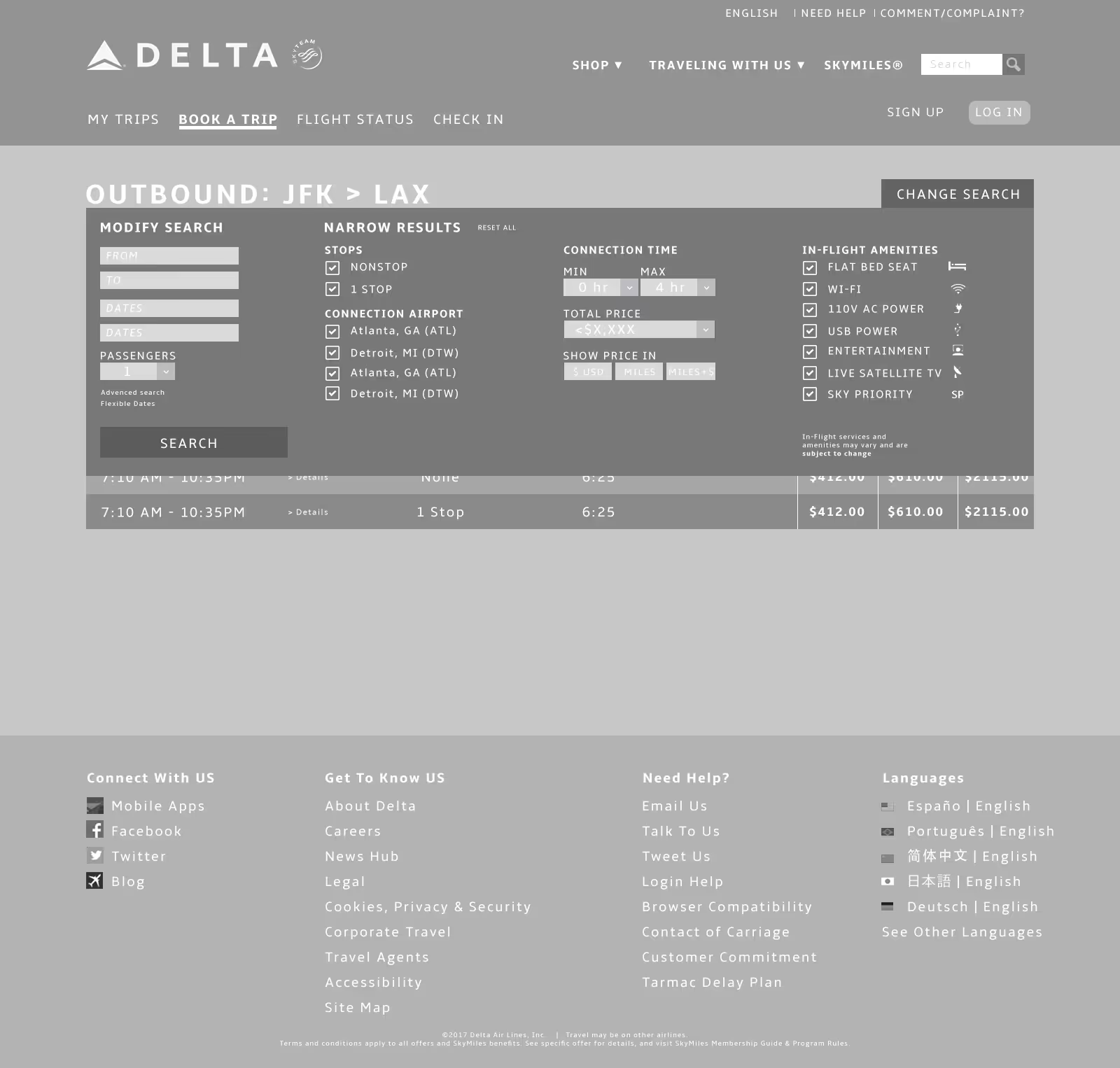
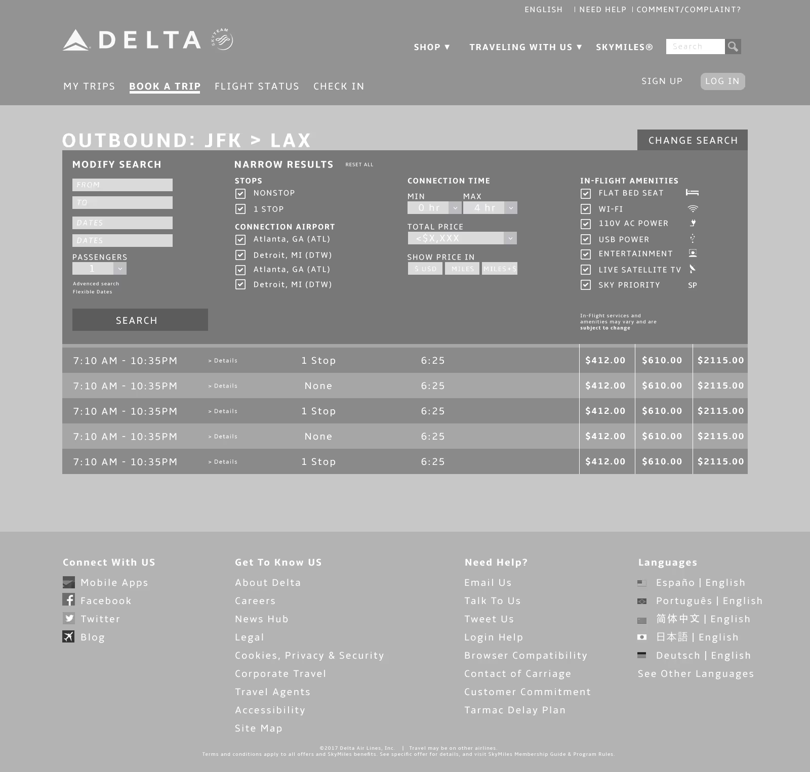
  • Enable easy modifications to search criteria in case of conflicts or changing plans.
  • Maintain Delta’s brand identity while creating a cleaner, more intuitive interface.
Solution Overview
  • Redesigned search results with a clean canvas approach, showing only the most relevant flight information.
  • Consolidated repetitive buttons, replacing multiple “Details” or “More +” buttons with a single expandable option.
  • Flight detail expansion includes seat availability, class-specific luxuries, and clear departure times and pricing.
  • Implemented a “Change Search” feature at the top, allowing users to quickly adjust dates, times, or other parameters.
  • Focused on a minimal, intuitive layout that guides users naturally through the booking process.
Impact
  • Streamlined search and booking experience, reducing cognitive load for users.
  • Improved visibility of key information like departure times and pricing, making comparisons easier.
  • Simplified interaction for expanding flight details and changing searches, reducing frustration.
  • Created a more user-friendly and efficient Delta Airlines booking experience without compromising brand identity.

Want to get in touch?
Drop me a line!

Lorem ipsum dolor sit amet, consectetur adipiscing elit.

Thank you! Your submission has been received!
Oops! Something went wrong while submitting the form.